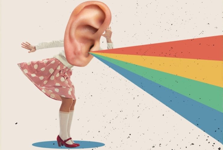
Top Call to Action Mistakes to Avoid
Your website can look stunning, your copy can sparkle, your marketing can be flying, but if your call to action falls flat, none of it matters. Calls to action (CTAs for short) are the moment your marketing either swims or sinks.
For businesses, this is where strategy becomes revenue, but still, we see the same call to action mistakes costing brands, leads, sales, and momentum every single day. So let’s strip them back.
Making Your CTA Sound Like Homework
‘Submit’
‘Register’
‘Complete Form’
These are the digital equivalent of a sigh. They’re impersonal, dull, and give users zero clue what happens next. This is where most bad call-to-action examples live. CTAs work best when they complete the sentence in your customer’s head. ‘Get my free guide’ or ‘book a demo’ feel much more active and personal. Homework rarely converts; curiosity often does.
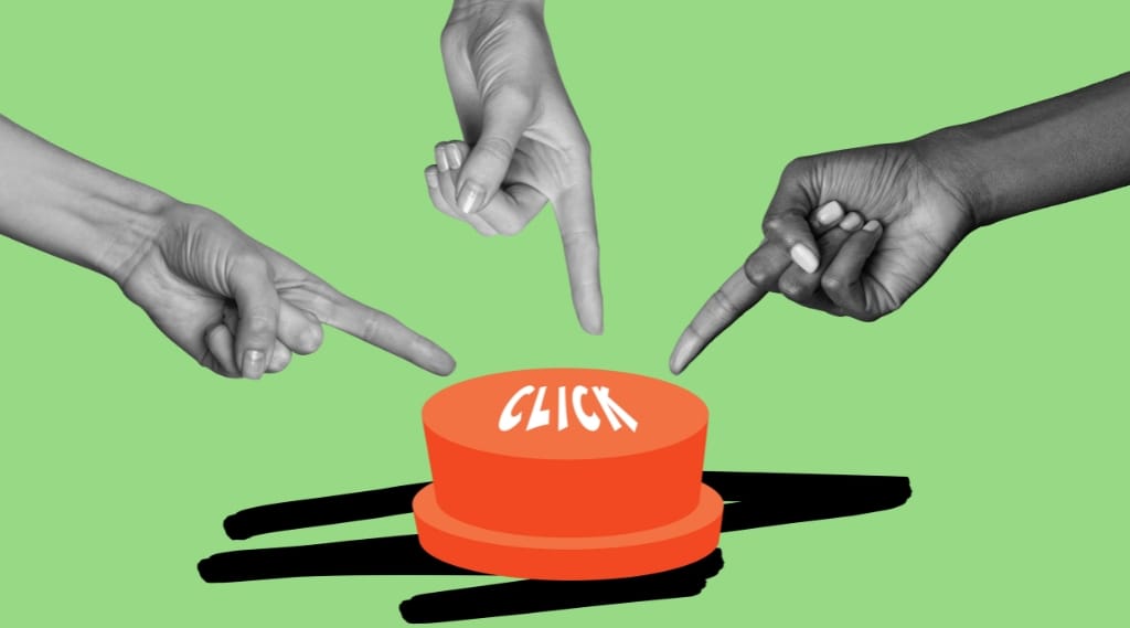
Choice Paralysis is Killing Your Conversions
If everything on your page is shouting ‘pick me’, your visitor usually picks nothing.
Too many CTAs cause friction, and multiple primary buttons confuse users. When no single action is clearly prioritised, people hesitate and bounce. One strong direction almost always beats six weak ones. This is a core part of call-to-action best practices, yet it’s constantly ignored. Your page needs to guide behaviour, not debate it.
Vague Language Hides Value
If your CTA feels safe, there’s a good chance it’s lazy. A good call to action tells people what they’ll gain, and guides them to information elsewhere. A vague CTA isn’t going to outperform one that’s specific and clear.
The best calls to action carry promise. ‘Download the checklist’ or ‘see an instant quote’ are compelling and informative. This is the core of how to write a call to action that actually drives clicks. If a benefit isn’t obvious, the action isn’t going to happen.
Want sharper CTAs across your website?
We help brands tighten messaging and improve their conversion paths through CTAs that people actually want to click. Find out more on our digital marketing page, or get in touch with us today.
Is Your CTA As Visible as Possible?
Your button can’t blend into the background. If it does, it might as well not exist. Low contrast or poor placement, as well as tiny text, are silent killers of customer action. CTAs need to stand out visually and sit where decisions naturally happen.
This is less about design trends or aesthetics and more about usability. When users have to dig through six scrolls of content to find the next step, why would they bother?
Don’t Ignore Risk Aversion
People are scared of commitment. Asking for a call, payment details, or a big-time investment too early is like proposing on the first date. You’re probably going to put people off. Caution is the standard setting for most people, so smart CTAs need to reduce perceived risk.
Things like free guides, trials, or instant checks are low-effort entry points that build momentum without pressure. The best call-to-action practices respect where a user is in their decision-making journey. In short, focus on getting a second date, don’t try to book the wedding.
Tone Can Break Your Brand
Your CTA shouldn’t suddenly sound like a legal document if the rest of your site is warm and confident. A mismatch in tone creates friction and weakens trust. If your brand voice is bold, then your CTA should be too. If your vibe is more reassuring and calm, your CTA should feel supportive and understanding. A lot of band call-to-action examples fall down when they ignore the personality of your brand entirely.

Want to Avoid Call to Action Mistakes and Convert Traffic into Action?
We don’t treat CTAs as decoration; we treat them as engineering. Every word, placement, and interaction is built to move real people through real journeys. The One2create team is a creative marketing agency based in Hampshire, working with ambitious brands that want more than surface-level marketing. From strategy to branding to websites, campaigns, and SEO, we build everything with conversion in mind.
Get in touch with us today, and let’s sharpen your digital journey.
FAQs
What’s the biggest CTA mistake businesses make?
Being vague. If users don’t instantly understand the outcome, they won’t act.
Do CTAs really affect conversion rates that much?
Yes. CTAs are the bridge between interest and action. Weak bridges collapse.
Should every page have a CTA?
Every page should guide behaviour in some way, even if the CTA is subtle.
Are multiple CTAs always bad?
No, but there must always be one clear primary action.