For many marketers and business owners, the power of colour psychology might seem like a mystery. While it’s common knowledge that certain colours elicit specific feelings, this might not be something you’ve ever considered deploying as a marketing tool.
Here, we’re going to unpack the complexities of colour psychology and give handy tips on how to utilise different colours to enhance your marketing.
The Basics of Colour Psychology
At its core, colour psychology is the study of hues as an influence on human behaviour. The premise is pretty simple: colours evoke emotions, and emotions determine actions. It’s why numerous fast food chains incorporate bold reds and yellows into their branding – to prompt hunger, comfort, and a sense of urgency.
Where did it come from?
It all kicked off over two centuries ago when German poet and artist Johann Wolfgang von Goethe published The Theory of Colours. He claimed that colours had a profound impact on peoples’ emotions.
Initially, Goethe’s thoughts were rejected by the scientific community, but when psychologist Kurt Goldstein revisited the topic over a hundred years later, experiments found that Goethe was right all along.
How is Colour Psychology Used in Marketing?
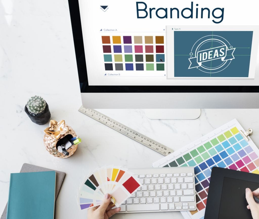
Understanding how different colours evoke different emotions is a crucial step when you’re developing your logo, brand, or marketing campaign. Factors like gender, nationality, and age can further complicate colour perception, so having a nuanced, holistic approach is vital.
In branding, colour choice is paramount.
It can massively impact brand perception and consumer decision-making. Research suggests that colours contribute up to 90% of snap judgements about products and services, so their importance shouldn’t be underestimated. Brands have to understand how to utilise different colours for marketing and advertising, as well as communicating their chosen archetype.
It also directly impacts conversion rates.
Your choice of colour can influence brand affinity and purchasing behaviour, too. Businesses can strategically deploy colours to differentiate themselves and drive sales, leveraging various psychological principles like the Isolation Effect to stand out in a crowded market.
Maintain a Nuanced Approach
While implementing colour psychology in your marketing can be a powerful tool, it can also present a few complications when not done carefully.
Cultural Differences
Colours have different meanings and associations in different cultures. For example, in much of Europe and North America, red symbolises excitement and passion, while in some East Asian cultures, it can represent luck, long life, and beauty.
This means that marketers operating in diverse environments must be sensitive to these cultural nuances to avoid sending unintended messages or even causing offence.
Individual Variations
People’s responses to colours can vary based on personal experiences, preferences, and psychological factors. This is why knowing your target audience is so important. Do your research, and try to recognise and understand your ideal user’s preferences and perceptions.
Brand Consistency
Both in colour psychology and beyond, brands must always maintain consistency. When it comes to choosing the right shade, make sure you’re keeping it relatable and identifiable across the various touchpoints you use, be it your website, social media, or physical adverts.
A Rundown of the Rainbow
So, you want to implement colour psychology in your marketing, but which hue is right for you? Let’s take a look at how different colours can evoke different emotions, as well as some real-world examples of how brands are using them.
Green
Green is frequently used in marketing to evoke feelings of health, freshness, and sustainability. It’s commonly associated with environmentally friendly products and brands. Think of The Body Shop, which uses a phthalo shade to convey its commitment to natural and ethically sourced ingredients.
Red
As we’ve mentioned above, red is used throughout the marketing world to inspire energy, excitement, and urgency. Ferrari has nailed this by utilising red as their signature colour. While their badge is a striking yellow, it’s often seen nestled on an invigorating red background, evoking passion and a hint of danger.
Purple
Since the days of the Roman Emperors, purple has been linked to royalty, luxury, and sophistication. This makes it perfect for high-end or decadent products and brands. In the UK, Cadbury uses a blend of purple and gold to bring a sense of richness and indulgence to their range.
Orange
Lending itself to a sense of adventure, creativity, and enthusiasm, orange can be used to create a real sense of adventure. This makes it a great choice for brands targeting a youthful and dynamic audience. EasyJet uses a Pantone orange to make their budget airline offerings pop, reflecting their energetic approach and appealing to young, budget-conscious travellers.
Yellow
Yellow can be used to create a cheerful and welcoming atmosphere with connotations of friendliness and warmth. Think of McDonald’s golden arches, Pokémon’s playful Pikachu, or Snapchat’s ghost bobbing about on a yellow background. It’s a social colour that promises good times and happiness.
Blue
It’s no coincidence that three major banks (Halifax, RBS, and Barclays) use shades of blue in their branding. It’s used to convey trust, reliability, and professionalism, making it a go-to choice for the financial sector and healthcare organisations like the NHS and Bupa.
Are You Looking to Implement Colour Psychology in Your Marketing?
At One2create, we’ve got an expert, in-house team that can help you make the most of colour psychology in your marketing. From experienced brand and design experts to marketing gurus, we support you every step of the way to ensure a strong brand identity, as well as an excellent ROI.
You can find out more about our branding, design, and marketing services by following the links. Or why not get in touch? We’re always happy to chat about ideas with you.


